Building a mobility platform from the ground up.
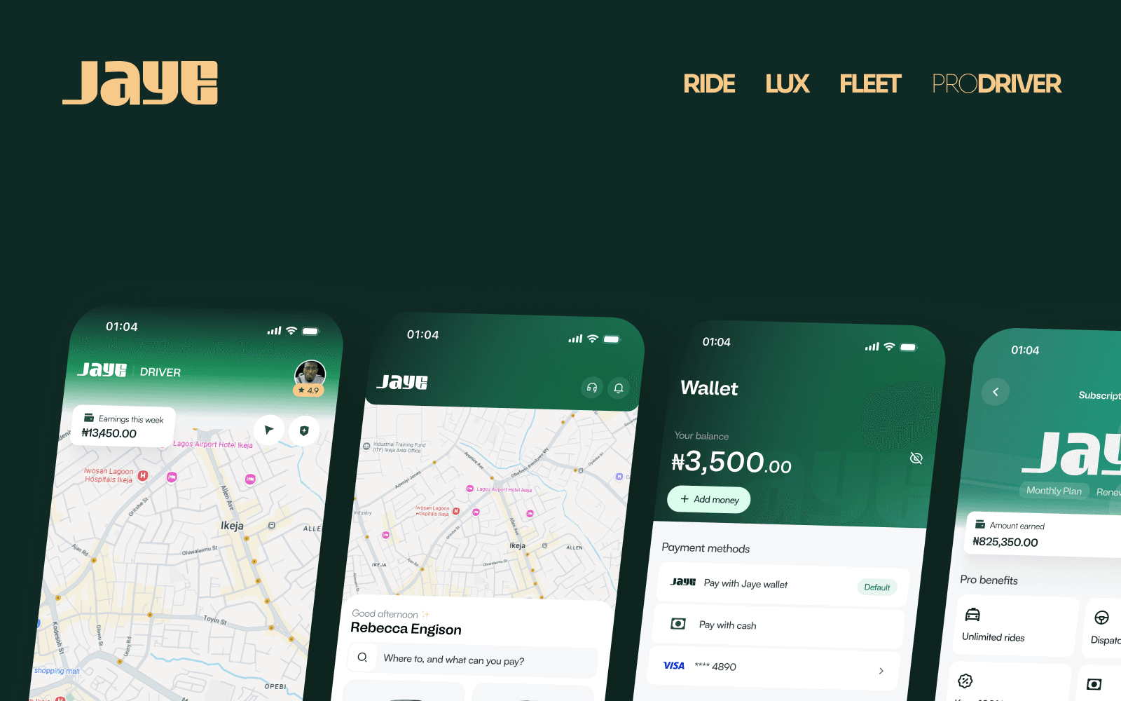
Jaye is a mobility platform designed to make moving around easier for customers while creating a better earning opportunity for drivers.
I joined the project from a clean slate and owned the design from the brand and visual language through the product experience, flows, and design system.
The result is a 150+ screen product spanning customer, driver, and administrative experiences.
One platform. Two sides of mobility. Designed from the ground up.
- Role
- Senior Product Designer · Sole Designer
- Timeline
- July 2026 — Present
- Scope
- Brand · Product Design · UX/UI · Design System · iOS · Android
- Product
- Mobility Platform
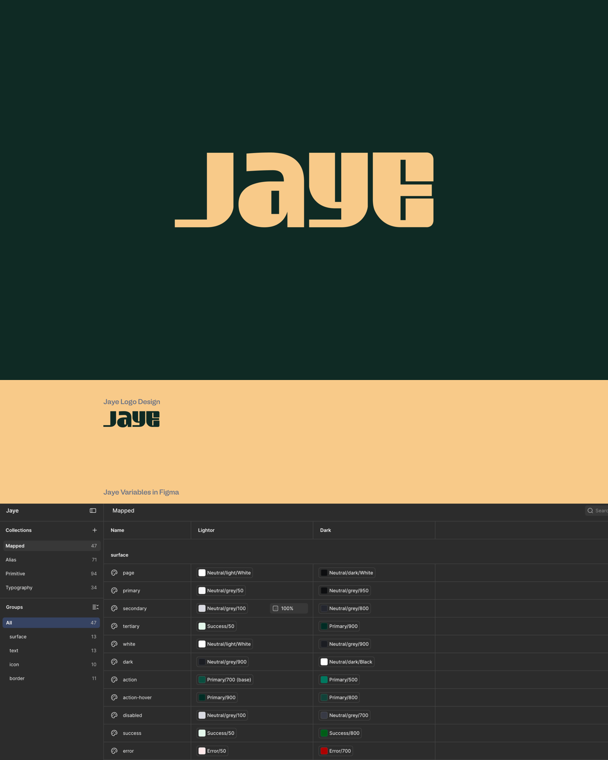
From a blank canvas to a real product.
Starting from zero meant there was no existing interface, system, or established visual language to inherit.
I had to define how Jaye should look, feel, and behave across the entire product — from the logo and brand guidelines to the smallest interaction in the apps.
As the sole designer, I carried that language across the customer and driver experiences while making sure the product could support the different needs of both sides of the platform.
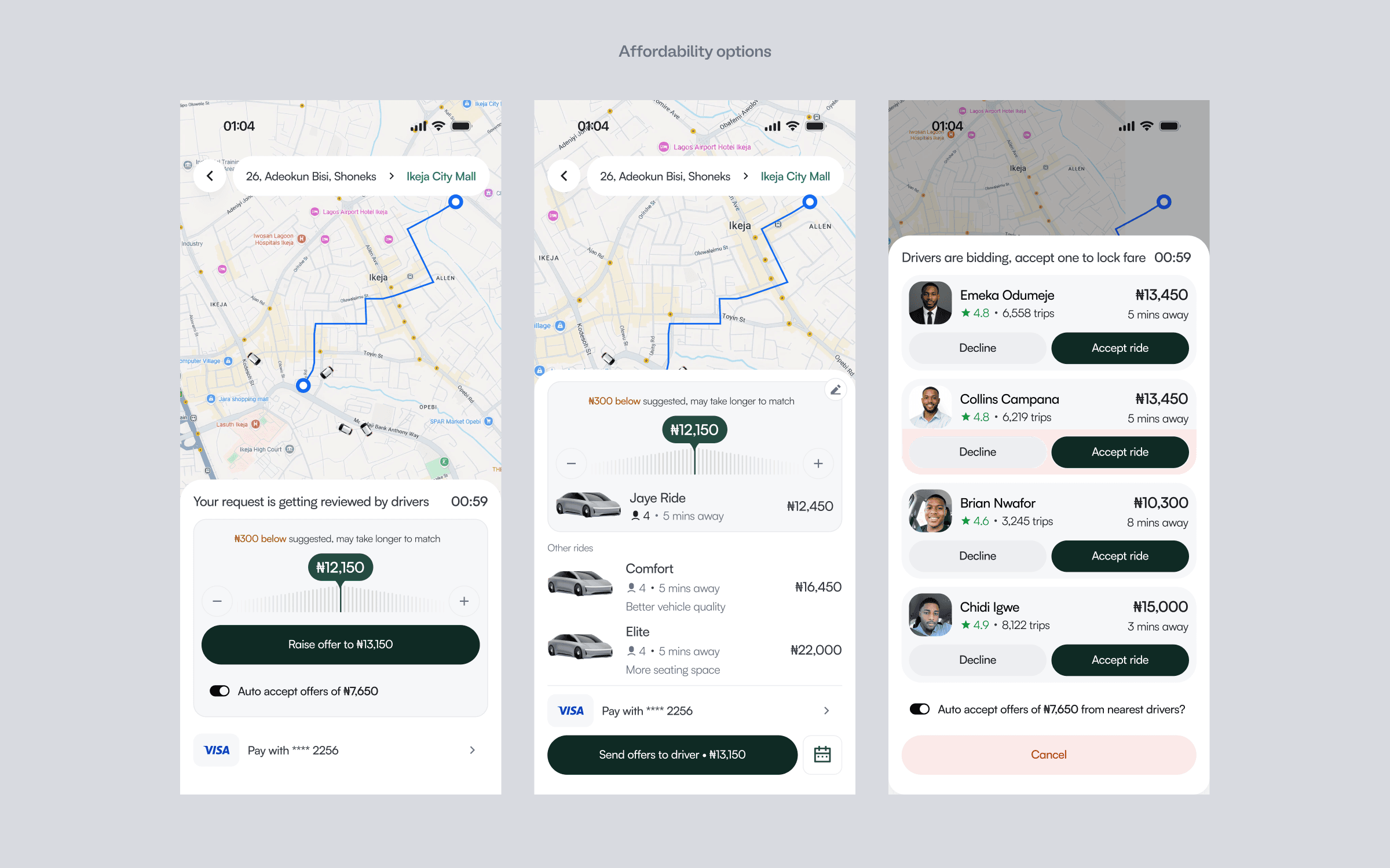
Making mobility more accessible.
A better ride shouldn't only be available to people with a particular budget.
One of the decisions I designed into Jaye was giving customers different ride categories based on what they can afford.
The most accessible option for customers who want to spend less.
A balance between affordability and a more comfortable ride.
A more premium experience for customers who are willing to spend more.
Instead of forcing every customer into the same experience, the ride selection becomes a decision that reflects their budget.
A good ride shouldn't depend entirely on luck.
Consistency in ride quality is one of the things Jaye needs to earn from its users.
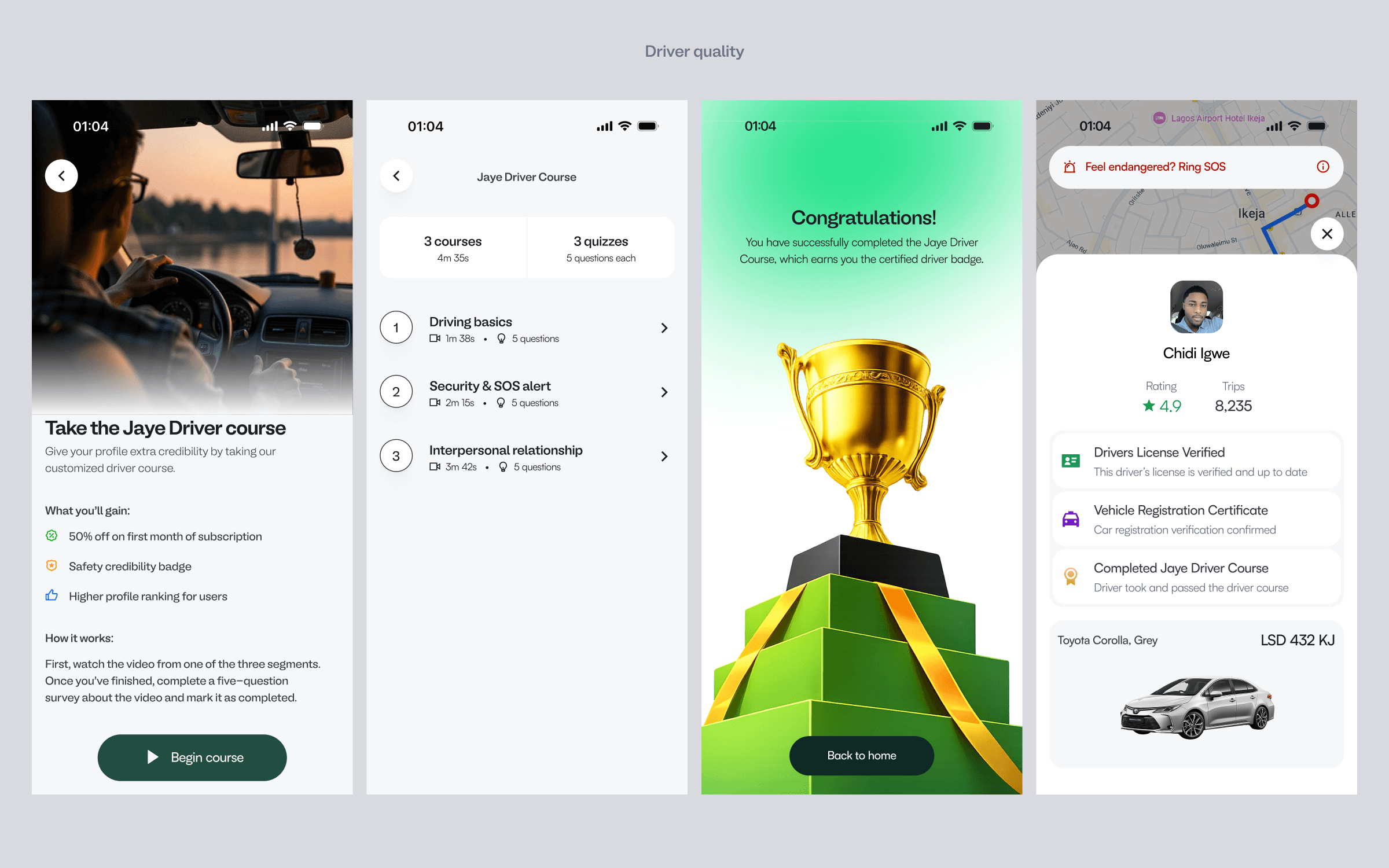
So I designed a driver course and assessment directly into the onboarding experience.
Before drivers begin operating on the platform, they can complete a one-time course covering areas such as:
Drivers receive a score after completing the assessment, and that result is reflected in the system and retained in their profile history.
The idea wasn't simply to tell users that Jaye cares about quality.
It was to design a mechanism that actively supports it.
Drivers aren't just the other side of the app.
They are customers of the platform too.
Jaye needed to give drivers a clear path from joining the platform to actually earning through it.
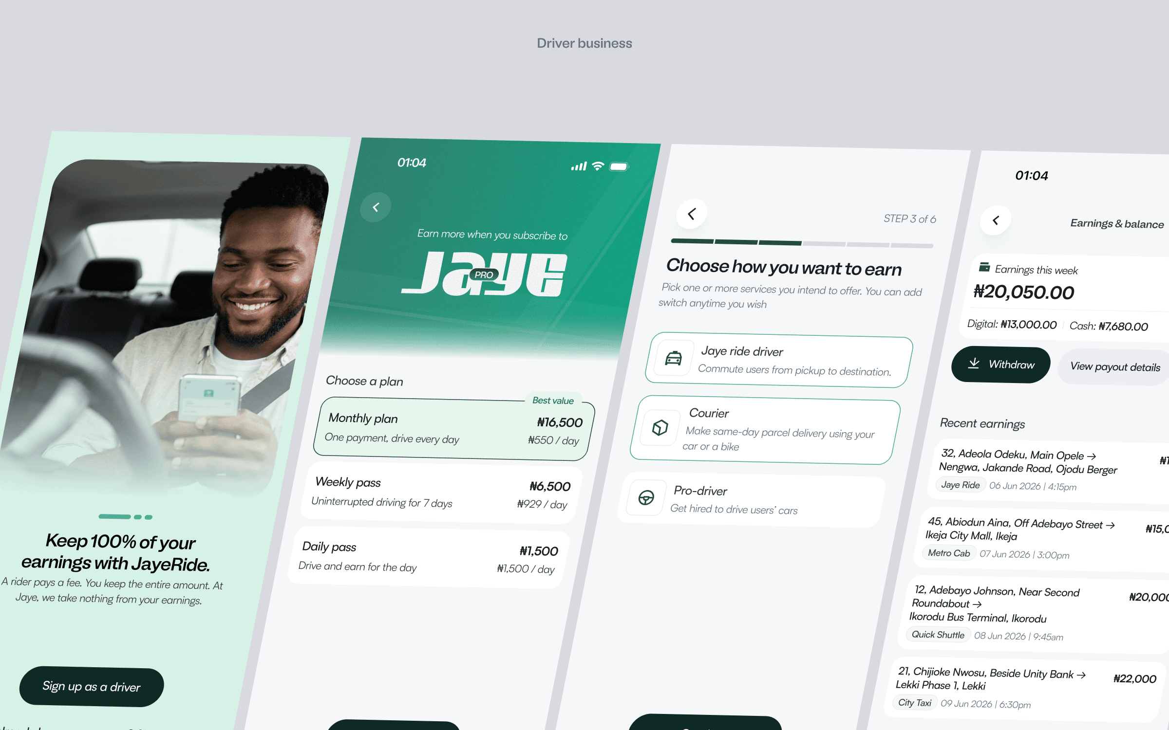
I designed the driver experience around that journey — from onboarding and subscription to receiving rides and managing their work on the platform.
One of the key parts of this experience is the subscription model.
Drivers get a 30-day free driving subscription offer, and after subscription, they keep what they earn on the platform without additional charges being taken from those earnings.
The design needed to make this value immediately understandable without overwhelming the driver during onboarding.
More than just getting from A to B.
Jaye isn't limited to one type of mobility need.
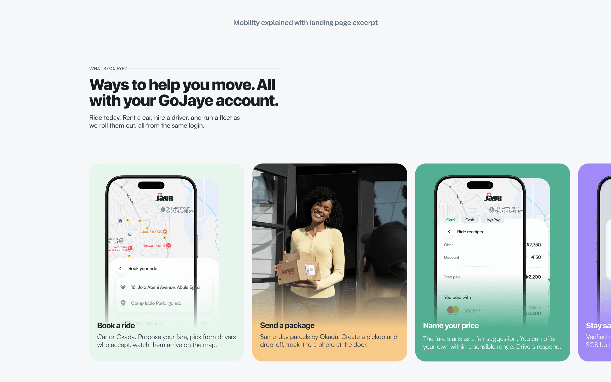
The customer experience supports multiple ways of using the platform:
Book a vehicle and get from one location to another.
Send a package from one place to another.
Book a professional driver to drive your own vehicle.
Each service introduces a different flow, but they all need to feel like part of the same product.
One product can't feel like two different products.
Jaye is designed across both iOS and Android.
That introduced another layer of complexity: creating experiences that feel consistent with the Jaye design language while still working naturally across different platforms.
The goal wasn't to make two identical products.
It was to create one coherent product system that could adapt to both platforms without losing its identity.
Designing from scratch doesn't mean seeing everything from the start.
I also used AI as part of my design review process.
For a few screens and flows, I used Claude to review the experience and help surface things I might have overlooked.
It became particularly useful when working through complex flows because I could move quickly while still challenging the decisions I had already made.
AI wasn't replacing the design process.
It became another layer of review — helping me catch gaps, question assumptions, and explore flows more thoroughly.
From design to launch.
Jaye is now approaching launch.
The customer application has shipped, while the driver application is in its final stages of design and preparation.
A group of users has already been gathered to test the driver experience before launch, giving the team an opportunity to identify issues that may not have been visible during the design process alone.
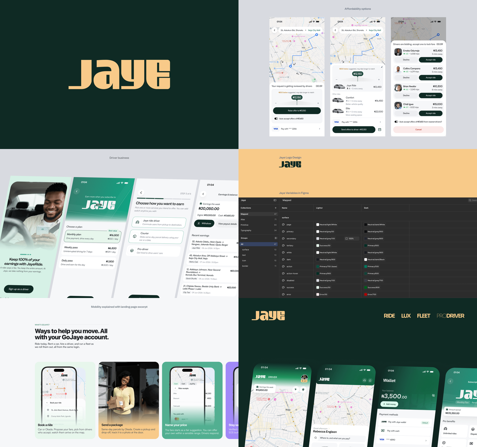
The product now spans more than 150 screens across customer, driver, and administrative experiences — all built from the same foundation that started with a blank canvas.
Reflection
I came to understand that users will always have conditions and edge cases that we may not be able to cover in the first iteration of a design or even the first round of launch.
That is a challenge that's difficult to foresee.
The best we can do is cover as much ground as possible before launch, build a strong foundation, and leave enough room for the product to evolve as real users begin to interact with it.
From zero to a mobility platform.
Jaye started with a blank canvas.
My job was to turn the vision into a product system that could actually carry it — from the brand and visual language to the experiences customers and drivers interact with every day.
150+ screens.
Two core sides of the platform.
One design language.
And we're almost ready to put it in the hands of more people.